

Design For The Post-Modernist
- Sep 12, 2018
- 2 min read

Theme
Interpreting my personality while maintaining a professional identity can be risqué business, so I like to start with traditional black and white themes and introduce bold pops of colour. The theme I have chosen is called 'Minimal', it represents a modern and state of the art design choice. ... Whenever I have an idea for a new project, I like to start with a simplistic approach and a clean palette, this is why I have chosen the 'Minimal' theme. Minimalism is a term referring to those movements or styles in various forms of art and design, especially visual art and music, where the work of art is reduced to its necessary elements. ... Minimalist style is distinguished by superior materials that give the impression of an apparently moderate luxury.
The crisp and well-balanced design conceptualises an easy viewing and navigational outlet for visitors of the blog, while the modernistic features create a visually encapsulating experience. The front page engages the visitor with a bold fashion and design video heading, demonstrating the modern and technically sophisticated service I wish to bring to my clients.
Colour Palette
I have chosen a white Colour palette as the base of the blog, in colour psychology white is the colour of new beginnings, of wiping the slate clean, so to speak. It is the blank canvas waiting to be written upon. While white isn't stimulating to the senses, it opens the way for the creation of anything the mind can conceive.
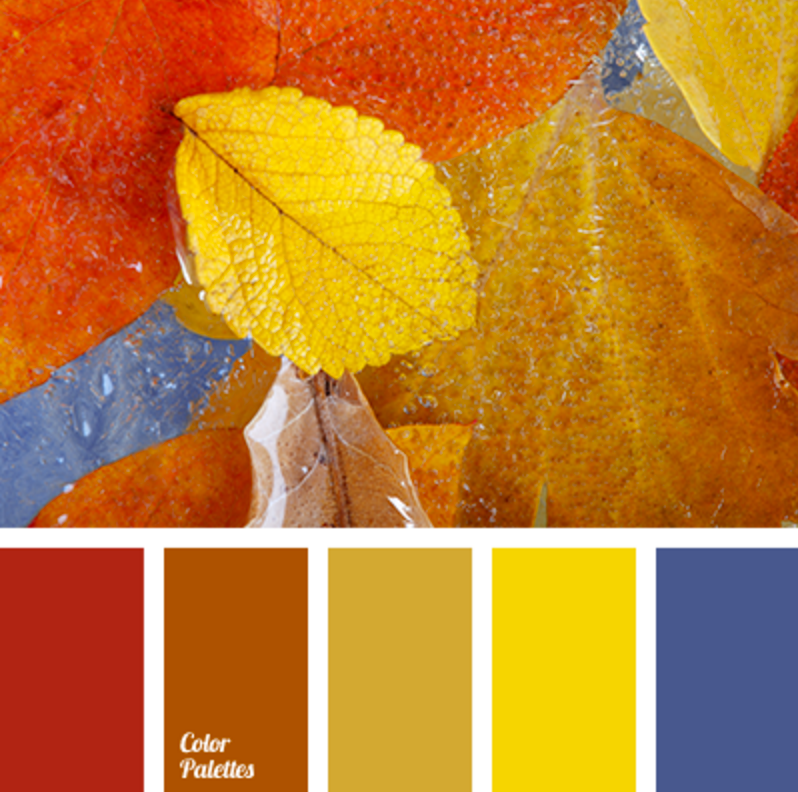
White contains an equal balance of all the colours of the spectrum, representing both the positive and negative aspects of all colours. Its basic feature is equality, implying fairness and impartiality, neutrality and independence. It is interesting to note that babies come into the world with a perfect balance of white, ready to imprint their lives with all the colours of the spectrum. The other shades that best represent me in the colour palette are yellow, orange, green and blue. These shades are earthy and represent an Australian outback aura, soft pastels and burnt oranges have a beautifully contrasting effect together which I like to incorporate into my own designs.

Type Font
The 'Minimal' - 'Sans Serif' style type font has been used consistently throughout the blog for an optimal reading experience. This type font is simplistic and professional stepping back and letting the imagery do the talking. The Sans serif type font first appeared in the Modern era when revived typefaces were flooding the typography mainstream. It wasn't an absolutely new idea at that time, since first sans serif faces had appeared in the beginning of 19th century; but never before this seemingly peripheral and exotic trend claimed so much importance as in 1920s and 30s.
When the first examples of sans serif fonts finally appeared, they seemed so controversial that the first name given to them was "grotesque," and they were very rarely used except in advertising. And so it remained until the newest trends in art and industrial design, most notably the German Bauhaus movement of 1920s, required adequate means of typographic expression. These movements stressed utilitarian aspects in design, claiming that a thing becomes beautiful only when---and because---it serves a practical purpose, denying any attempts to artificially "adorn" it.

Comments